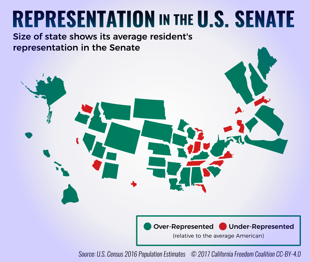
The area of each state on this map shows how much representation in the U.S. Senate the average resident gets. For example, the average Wyomingite gets 66 times as much representation as the average Californian, so Wyoming appears 66 times bigger.
States whose residents receive less Senatorial representation than the average American are colored green, with the rest colored red.
This map is Creative-Commons licensed (CC-BY-4.0), so you’re free to remix this map and create your own—just give credit. You can download an SVG file, or the complete source (including SVGs and fonts) used to create the infographic above.
Credits: Dave Marin and David Rodriguez.
Please contact dave.marin@independentca.org with requests for supporting data and other questions.
Further Reading
Edit, 2017-07-05: read Backers of California Secession Say State’s Senate Representation Is Dire by Pulitzer Prize-winning L.A. Weekly reporter Dennis Romero
Smaller States Find Outsize Clout Growing in Senate by New York Times reporter Adam Liptak in Nov. 2013
Sizing up the Senate: the Unequal Consequences of Equal Representation, a book published in 1999 by political scientists Frances E. Lee and Bruce I. Oppenheimer