Is California too big to be a U.S. state, or are most U.S. states just too little?
1. If every state were the same size as California
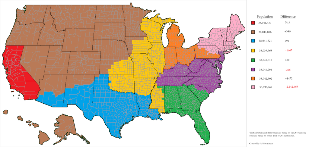
If every U.S. state had roughly the same population as California, there would be not fifty states, but eight, as show in this map by Reddit contributor u/Hormisdas. The unrepresentative nature of American institutions like the U.S. Senate and Electoral College would become largely moot, and California voters would enjoy political equality with other Americans. As a bonus, many regional issues that currently require the federal government to coordinate between states could instead be handled by state government.
The way things are now, while Californians have two senators, other California-sized populations in the U.S. get at least six, and in some cases (the brown “state” on the map) as many as thirty. This, despite the fact that U.S. state boundaries are largely the arbitrary result of British colonialism and U.S. western expansion. In the case of North and South Dakota, an existing territory was admitted as two separate states to create twice as many Republican senators.
2. If all 50 states had equal population
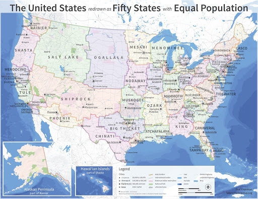
Americans like having fifty states, they like having the world’s oldest republican system of government, and they like the idea that all people are equal.
In this beautiful Electoral Reform Map by blogger Neil Freeman, they could have all three. Freeman re-imagines the U.S. as 50 states each of roughly 6,175,000 people. “The fundamental problem of the electoral college,” he wrote prophetically in a 2012 blog, “is that the states of the United States are too disparate in size and influence. The largest state is 66 times as populous as the smallest and has 18 times as many electoral votes. This increases the chance for Electoral College results that don’t match the popular vote.”
California, of course, could not exist in such a map, but six of the map’s states (Mendocino, Yerba Buena, Tule, Los Angeles, Temecula, and Orange) come entirely from California territory.
3. If state size reflected representation
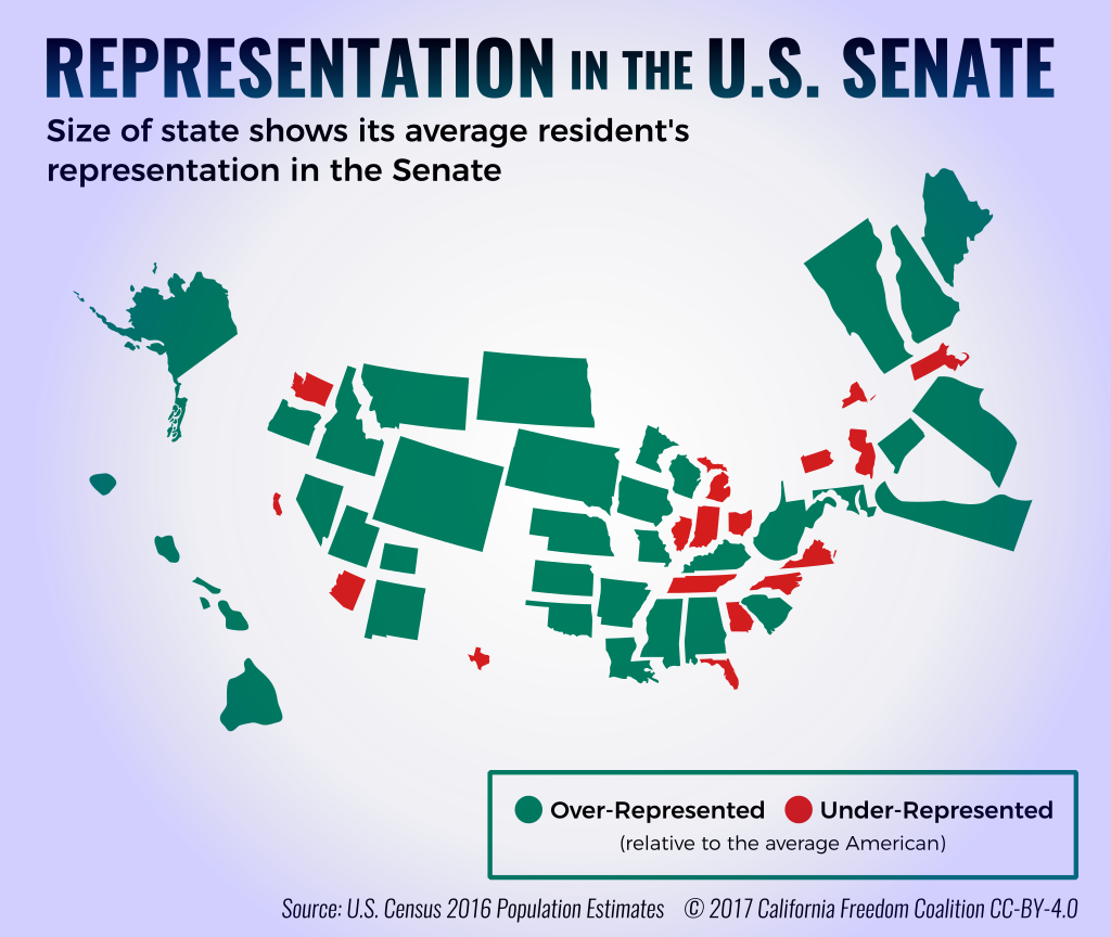
Rather than redrawing state boundaries to show the absurdity of treating all states as equals, this map from the California Freedom Coalition shows it directly. Each state is resized to show its average resident’s representation in the U.S. Senate. The smaller the state’s population, the more representation each resident of that state has in the senate, and thus, the larger it appears on this map. Wyoming crowds out other western states, and Delaware no longer fits on the eastern seaboard, while California and Texas are reduced to tiny specks.
“Not only is the makeup of the Senate terrible for Californians, it doesn’t even benefit the average American,” said Dave Marin, the map’s creator, in an interview with the LA Weekly. “The map shows that lots of states’ residents are overrepresented in the Senate, but those states compose less than 30 percent of the population.”
Note: Dave Marin is currently part of the The Independent Californian editorial team.